Before the course started I was always convinved that editorial design was something I would be really interested in however the thought of making zines and the process of making the books for Danny's design principles have made me realise I am actally not interested in them at all.
I enjoyed creating and drawing the content for the book I am making for Danny however I am not enjoying the process of getting it printed out and put together.
The making of my product packaging design for PPP was something I enjoyed much more, and seeing innovative packaging designs is something that excites me much more than seeing a beatifully laid out magazine spread.
Here are a few examples of packaging design that have recently caught my attention and inspired me:
This is a student project designed by Emma Strauster that focusses on the concept of bottled air.
he
marketing surrounding the bottled water industry is described as “one
of the most successful campaigns the world has ever swallowed”.
Australians alone drank 115 Olympic-sized swimming pools of bottled
water last year, and this year it is predicted that sales of bottled
water will surpass sales of all other bottled beverages combined for the
first time.
Why do we consider it acceptable to charge for something that flows
freely from a tap? If this practice is so widespread, what’s the next
thing we’re going to buy only because of how it’s sold to us?
Atmos is a presently critical, prospectively speculative project,
designed to corner the market for the booming bottled air industry, two
decades from now.
Modelled on the language and methodology surrounding the current bottled
water industry and combined with marketing methods drawn from A.H.
Maslow’s Theory of Human Motivation, Atmos is a satirical take on this
advertising hysteria, where everything from the packaging to the product
itself is exaggerated, but the language is taken directly from current
materials.
It’ll blow you away. - See more at:
http://www.packagingoftheworld.com/2016/02/atmos-breath-of-fresh-air-student.html#sthash.uf7mSHdp.dpuf
Everything from the materials to the pattern used on the packaging has incredibly thought our reasoning behind it and has been considered down to the tiniest details, to create an impeccable finish.
Read the full article here: http://www.packagingoftheworld.com/2016/02/atmos-breath-of-fresh-air-student.html
Another exaple of interesting a beautiful packagn design was by Graphic Designer and Illustrator Hannah Hart.
The tequila bottles were inspired by the culture, arts and history of Mexico, specifically Talavera. Talavera is the word used to identify the beautiful handmade pottery and fine ceramics that are trademarks of Mexican craftsmanship. To give each bottle of tequila the utmost feeling of prestige, the bottles incorporate an important element in Mexican culture and history: Mayan gods. Religion played an enormous role in talavera ceramics so the characters on each bottle had to be illustrated in a sophisticated, yet lively way. The gods that are seen on the substrates are: Yum Kaax, The God of Nature; Chaac: The God of Rain; and Kinich Ahau: The God of the Sun.
This packaging design by babe scrub, an Australian cosmetics company also highlights another interest of mine, hand rendered typography. I really like the minimalist black and white colour palette and the motivational quotes on the front. The added shiny copper gilding is also a nice touch.
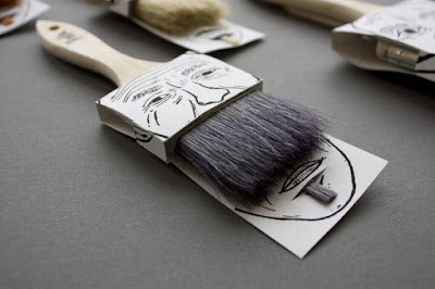
Another example of where illustration is mixed with packaging is the Poilu brush packaging by Simon Laliberté, which is a really simple yet clever idea.


No comments:
Post a Comment