Wednesday, December 20, 2017

OUGD602 - iTunes - 2018/19 Internship opportunity

In the Christmas holidays, I received this email from uni highlighting an opportunity for a graphic design internship at iTunes. After reading it I felt that I may as well give it a shot otherwise I'd never know if I could have got it or not. It was definitely worth a try. Therefore I got my CV and website up to date over the holidays so I could apply in time for the deadline in Janurary. 

The email: 


Apple Music is all the ways you love music, all in one place. But music is just the beginning. On iTunes you can enjoy films and TV programmes in amazing 4K HDR. The App Store opens a world of possibilities with the world’s largest and most innovative software store. iBooks will unlock your next great read. And on Podcasts you can subscribe to free serials about anything and everything.

As an intern at iTunes you will be given a unique opportunity to work alongside our teams and contribute to our growth and continued success. 

The Role: We are looking for an exceptional candidate to join our London-based internship programme to work as a Graphic Designer. The internship will commence in July 2018 and will run for 51 weeks. This is a full-time role which is competitively salaried. 

From day one, you will be charged with a variety of responsibilities. These include creating cutting edge designs to showcase the latest music, film, TV, app and book releases. You’ll also have the opportunity to work alongside senior designers on special project work and respond to briefs with conceptual ideas to promote editorially selected content across our stores. You’ll gain invaluable experience working with art directors who will provide feedback, guidance and direction in an iterative working process.

In awarding this level of independence and responsibility, we are looking for candidates capable of grasping complex tasks and delivering to the highest standards. Every day will be different, rewarding and challenging. We Want Someone With:

 • A genuine passion for digital content whether it be, music, film, TV, apps or books.

 • Expert Photoshop design and retouching skills. • A passion for typography and layout composition area is a must.

 • A keen awareness of visual trends associated with entertainment design and communication.

 • The ability to learn new processes and technology quickly.

• A talent for working well with others. We work very collaboratively at Apple. 

• Strong organisational skills and the ability to work under pressure. 

• A hands-on, can-do approach to problem solving and exceptional attention to detail. 

• An enthusiasm to learn new skills — and no fear of asking questions.

• Excellent English communication skills — written and oral. 

Application Requirements: 

• Be Availability in February 2018 for interview in London. 

• A predicted or achieved 2:1 undergraduate degree grade or higher.

• Availability to complete the full 51 week internship programme starting on July 1, 2018.

• Eligibility to live and work in the UK. (Documented evidence of eligibility will be required from candidates as part of the recruitment process.) 

How to Apply: Please submit your CV and covering letter, no later than Sunday, January 21, 2018 to itunesdesignintern@group.apple.com. All CVs must be accompanied by a portfolio and/or website link.

Tuesday, December 12, 2017

OUGD602 - Connor - It's Nice That Talk

  • Art Director at it's nice that.
  • Started off as a blog for university
  • East London Studio
  • When making a publication set out the entire layout on a big board
  • Lecture in progress 
  • Apply to the Graduates
  • Apply to TDK Graduates
  • Sketch out / mockup what's in your head 
  • Simple visualisations really help
  • Mock things up physically

Friday, December 8, 2017

OUGD602 - Advice for building a website

Images
  • Size and crop your images properly
  • Don't need lots of the same photos from different angles, just a few select shots
  • Just enough to get main points accross
  • Include Gifs 
  • No bigger than 1MB
Add mail to link 

Test on mobile and desktop 

Thursday, November 30, 2017

OUGD602 - Career Track Tuesdays - LinkedIn


After almost missing an opportunity with a design agency for not being fully active on LinkedIn I decided to fully set up my account to ensure my engagement with the creative industry was as fully involved as possible. After attending a LinkedIn themed career-track-tuedays I got some helpful advice on how to make my account as visible and inviting as possible. Using an image of my work as the cover photo links my profile to that of my behance, instagram and website and using a photo of myself as the icon puts a friendly face to the name and apparently makes users trust your account more.

The descriptions are succinct and to the point, making me easy to find and connect with. 

Tuesday, November 21, 2017

OUGD602 - Talk with Liv Sidall (It's nice that, Rough Trade, Redundancy Radio)

  • Studied Graphic Design at Kingston University.
  • Thought her uni work was a bit silly- was a very conceptual course. 
  • Her tutor got her a job at it's nice that after noticing her interest in promoting work she liked the look of. 
  • Stayed there for four years going from an intern to the editor
  • Hosted events 
  • Was Part of the creative world, without having to make anything
  • Quit and went freelance 
  • Working alone for 6 months 
  • Wanted to start own magazine and move to New York 
  • Rough trade - music magazine asked her to be the editor 
  • Monthly 64 page
  • Record company founded in 1976/7 about people coming together talking about records 
  • Shops 
  • Film bands playing in the shop and interview them 
  • Start a new radio /podcast 
  • Magazine - representing vibe of the shop 
  • 5000 copies 
  • 1000 budget 
  • Looking at music magazines in London 
  • Inject fun into music magazine scene 
  • What if a magazine was a person - make it like a rough trade customer 
  • Old magazine - people could afford to be fun - freedom 
  • Bruce usher designer 
  • Good to make plan - refer and keep track
  • Issue every two and a half weeks
  • Templates - 10 albums of month 
  • Serious doesn’t look as enticing, Smiles 
  • Horoscopes from bands
  • Illustrate by Adam Hicton
  • Agony aunt - Johnathan Richmond 
  • Features building Up - structure 
  • Brett Fandonbrooker
  • Staff picks
  • Tour documenting disposable cameras
  • Art of musicians
  • April 2017 - handed over to be guest edited by Mac DeMarco
  • If you run out of budget just do everything yourself 
  • Staff didn’t want magazine but then after a while, they started to like and contribute, involving them more.
  • Made redundant August 29th
  • Cancelled mag after issue 18
  • Some things (mags) don’t last forever 
Life Tips
  • Find out what are you really in to?
  • What do you really want to do?
  • Don’t worry about what hasn't been done before
  • If you can’t do something get someone else to do it 
  • Ask for help all the time
  • Don’t worry too much about what you’re actually doing, just get on with it!
  • Tire theory - Someone will want to help you more if they can see you having a go (like changing a tire) 

Tuesday, October 24, 2017

OUGD602 - Finding an Internship - Tips and Advice


  • What should you get from an internship? Experience, contacts, mentorship.
  • Dan Cooper - The Nomad Designer
  • Try things, experiments, get them out there, fail etc.
  • Stand out from the crowd
  • Cool Bus - Bought a bus and travelled around the USA. Now works as an art director at a magazine in New York. 
  • Post thing on Reddit
  • There is always value in being yourself. Unique Mix.
  • Think creatively about your career.
  • Tap into your interests and passions.
  • When applying for an internship the best way to approach a studio is to taylor something to them.
  • Research and find out their core values and the way in which they work then tactically approach them. It will immediately set you apart from the crowd. Look at previous projects which they have worked on and then replicate one of your own in their way.
  • Do it as a quick project which you can then use in your portfolio.
  • Brand guidelines that you've proposed to the brand on their behalf.
  • Shows you've researched them and their brand.
  • Send it through the post. A physical thing to come across and then open.
  • Think Tactically.

Sunday, October 15, 2017

OUGD602 - Design Manchester 2017: Design City Reframed


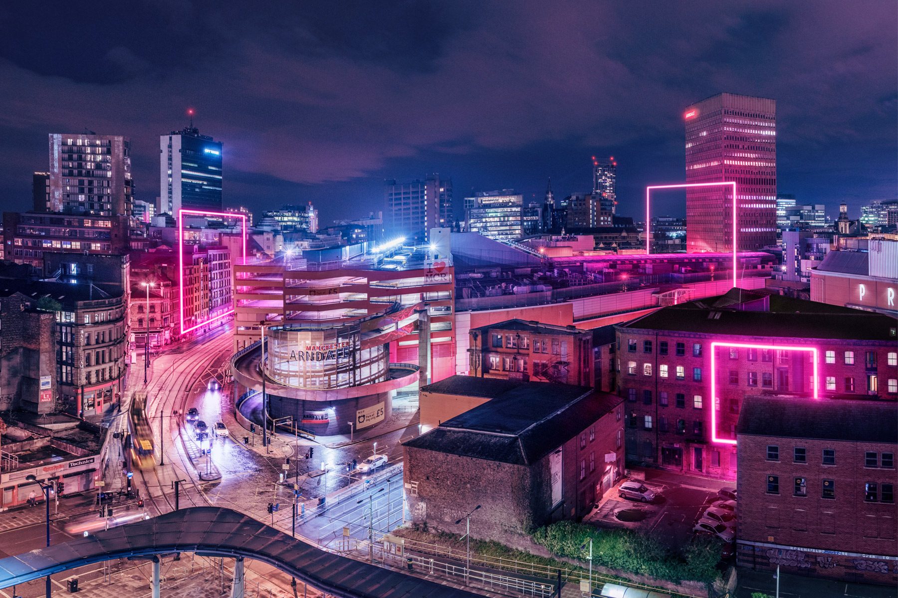
On Friday I headed to Manchester for the fifth annual Design Manchester Conference held in the heart of the city at the Principal hotel. The event featured an array of talented guest speakers from a wide range of different fields in the industry including graphic design, illustration, UX design and architecture:

  • Naresh Ramchandani (Advertising and communications partner at Pentagram)
  • Louis Mikolay (A graphic Designer from North Studio)
  • Alex McDowell (Narrative Designer, Founder and Creative Director of Experimental Designs)
  • Emily Forgot (Illustrator)
  • Tash Wilcocks (Illustrator and Designer, working for Hyper Island) 
  • Jane Murrison (User Experience designer for the BBC) 
  • Ellen Van Loom (Award Winning Architect, OMA)
  • Patrick Burgoyne (Editor at Creative Review Magazine) 
Despite the difference in individual disciplines of each guest speaker, the advice and anecdotes given could be translated into all areas of design. I made sure to take notes of advice that I could apply to my own practice throughout the day and other points which I found interesting. They are as follows:

Naresh Ramchandani 

  • It's really good to be a beginner
  • 'Getting old always felt to me like a long, slow march to expertise, but it's good to be naive, learn, and make mistakes'
  • Always try new stuff, follow your heart and be experimental 
  • Hang in there.
Louis Mikolay

  • For each brief you do, write down the key objectives and make sure they end result adheres to them. 
  • Eg. Must be simple, international, clear, memorable 
Tash Wilcocks

  • You need to put yourself out there and do something that scares you
  • Crush the anxiety - Turn it into excitement and energy 
  • A phone is a tool just like a hammer. You wouldn't put your hammer on the table just in case you might need it. 
  • Likes and notifications are more addictive than heroine - The inventor of the like button has a child lock on his phone and doesn't allow himself to have facebook or twitter
Alex McDowell


  • Traditional practices such as carpentry are not abandoned in today's societies, they can be enhanced for new and exciting projects.
  • Augmented reality - flying a whale over the audience
  • Virtual Reality - employs the art of theatre more than any other media
  • Empathy is crucial in design
  • AI has a very real possibility of enhancing virtual reality by bridging the gap between what humans are capable of, however, this is a very delicate relationship
  • Ancestral AI - how to continue engaging with people who have passed, by accessing their memories/mannerisms. 
Emily Forgot


  • Your opinions and the way that you see and experience things are what makes your practice unique to you. If that filters into your work it can make you stand out from the crowd.
  • No-one else will have the same experiences and memories as you
  • Find what makes you tick
  • Take the pressure off of trying to be original 
  • Notice the things the resonate with you - Interiors, Architecture, plants
  • Looking at fashion collections is a good place to find colour palette inspiration
  • Don't look in the same places that everyone else is looking for inspiration
  • Be as random as possible
  • Allow for brief distractions and procrastination at the beginning of a project 
  • In the long term, it is better to get creatively excited about a project like this than to get going straight away. 


Friday, September 29, 2017

OUGD602 - Frankie Ratford, The Design Kids


Today Frankie Ratford, founder of The Design Kids, an organisation that connects students with the design industry came into uni to host a talk with our class. Frankie is currently traveling across the UK, connecting with many incredible creative professionals and design studios as well as graphic design courses throughout England, Scotland and Wales.

Through persistence, gut and positivity Frankie has turned her passion into a career by combining design, travel and business. She has worked as a print designer, a lecturer, an intern, a blogger, a freelancer, a book binder and a bunch of other design related stuff. She’s lived in 13 cities, in 25+ houses and is currently road tripping around the world for six years, right now in Europe building the TDK empire. She started The Design Kids in 2009 and launched with a market stall in the front yard with some mates and a DJ.


Frankie's life is hard to believe as she is truly living the dream, travelling the world, meeting hundreds of inspiring creatives and getting paid to do so! Her motivational and positive attitude was really inspiring and just goes to show the right personality can get you anywhere you want in life.

She suggested a list of things to do before graduating to ensure success after uni: 
  • Attend Design Events (1 a week)
  • Start a personal project
  • Enter Design Competitions (1 a month)
  • Become besties with your lecturer
  • Tell everyone you're a graphic designer
  • Design a buisness card
  • Research your top 10 studios globally
  • Run TDK Tuesdays in your city
  • Put your final work on #TDKpeepshow
She also introduced us to the concept of Ikigai:


Thursday, August 10, 2017

OUGD602 - Work Experience - Penguin Random House

Following the success of my work in tyear'sears Penguin Student Design awards, I got the opportunity to do a month-long work placement in the Children's art department of Penguin Random House, at their headquarters in London on 80, Strand. In my time there I worked on a variety of briefs for a range of different children's books as well as doing work for the more senior designers such as creating mood boards and attending covers meetings. 

Over the course of a month, I got a really good insight into the world of publishing and what goes into designing a book, the process, timescale and the roles of different designers involved. The prep involves reading the original manuscript, then having a meeting with Anna Bilson, the head art director of the children's art department. Then a brief is created in conjunction with the author with guidelines to follow. 

Whilst I was there I had to opportunity to work on a book cover from start to finish, called 80, a poems book celebrating the life work of Roger McGough. The brief was to design a cover that would fit in well with the other books in the series that had been previously published. The cover also had to feature one of the poets own illustrations. 

These were the series of existing covers: 


A few examples of my design developments: 


Every Wednesday there was a cover meeting with the heads of different departments such as sales and advertising to discuss which designs worked the best and which to take forward. After going through various covers meetings my designs were consistently chosen after every round which meant it got chosen to be published out in the real world which is insaaaane!

Finished design out in the real world: 


The children's art department at Penguin designs the Puffin books range which is aimed at readers ranging from 5 years old to 17/18 years of age.  This meant that the different styles that I was working with were extremely varied as the demographics of readers differed so much. As a designer, I had to constantly adapt my style to fit the target audience of the book. These are a range of other books I worked on in my time at Penguin: 

Bodyguard: Fugitive by Chris Bradford

Brief: Design a cover for the Fugitive that fits in with the previous books in the series. The cover must feature both of the main characters. In the book, the girl is in a wheelchair so should be positioned in a way that reflects this (lower down than him). The plot of the book is set in Shanghai in China so this may influence the background of the design. The title and plot of the book suggest that the main character is a fugitive, therefore he must appear to be on the run in some way. 


The Secret Diary of Adrian Mole: Sue Townsend,  Classic Covers range

Brief: Design the cover for the Secret Diary of Adrian Mole to fit in with the rest of the Penguin Classics range. Limited colour palette, vintage texture. 


The Bog Queen - Abberations: Joseph Delaney

Brief: Design a cover for Joseph Delaney's science fiction fantasy book the bog queen, a book aimed at 10 - 12-year-olds featuring monsters, slime and scary creatures. The book is set in dark wartime settings. The blurb is: 

'They heard shouting, and cries of fear. Crafty looked down the slope and realised what had happened to cause so much panic. Without warning, the dark wall of the Shole had advanced.Crafty can't remember a time before the Shole - the terrifying mist that has engulfed most of Britain, leaving those trapped in it to either die or be transformed into terrifying monsters- the aberrations. Crafty has been stuck in his family's cellar for nearly a year, his only companions his restless, whispering dead brothers, and an unusually friendly aberration he names the Bog Queen. But then Crafty's life abruptly changes. He is ordered to report to the Castle, where he will train as a gate grub - operators of magical portals that allow the mysterious guild of Gatemancers to explore within the Shole. It is a dangerous job, with a very short life expectancy . . .

To survive, Crafty will have to use every inch of his cunning - whatever the cost.'

Setting: could be woodland/marsh. Castle may be featured. 

We were given an abstract from the book featuring the main character, a white snakelike monster and an orb of light to base the cover on. 

My designs: 


The truth and lies of Ella Black: Emily Barr

Brief: Design a cover for the truth an lies of Ella Black, a book aimed at 13-16 year olds. The book takes place over a variety of settings but is mainly set in Rio de Janeiro. The book features a girl who has a dark side of her that comes out to torment her and ruin her life called Bella (Bad Ella).


Other briefs I worked on:


As well as shadowing the senior designers and working on a variety of book covers I also did work sourcing illustrators to be used on a variety of covers that the other designers were working on. The process at penguin often involves an initial layout being made by a designer that is then adopted by a chosen illustrator. An agent from Pickled Ink came in to show work from a range of illustrators in her agency who may be suitable for upcoming designs, which was something I'd never considered or heard about before working at Penguin. 

As well as this I was also sometimes given other odd jobs such as designing a poster for the following years design awards competition. 

Evaluation

My time in the art department was really eye-opening and gave me a fantastic insight into the world of publishing and book design and the daily workings that go on there. You got a lot of creative freedom on the designs and it was expected of you to do at least 10 outcomes for each brief so the more ideas you had the better and all new ideas were welcome. If you could illustrate the cover yourself then there was no need to source an illustrator which saves money for the company.

Overall I had a really great time at Penguin! The team were absolutely lovely and always happy to help if you had any questions about the software or the process. Matt the senior director I was shadowing offered lots of great feedback and advice on my designs and was really encouraging throughout my time there. 

The best part was that I could take home 2 free books a day! which meant by the end I had about 60 books to give out to my friends and family. 

After the placement, I have kept in touch with the team at Penguin, but I decided I didn't really think publishing was for me. Working on book covers every day, although fun and rewarding, got a bit repetitive after a while and it isn't really something I'm that keen to going back to. Following on from my experience I've decided I would rather work in a design studio that covers a lot of different content from branding to packaging, to visual identity etc. However, it is an experience that I will never forget and I enjoyed every second of it!

Monday, May 8, 2017

OUGD502 - Summer and Level 6 Planning

I am still in shock about how fast 3rd year and Level 6 of the course has come around, however, I am really excited for opportunities that are to come in these next stages. I have already started planning my dissertation which has been somewhat inspired by the OUGD502 PPP modules this year. Hoping to interview a range of professionals for valuable primary research and identifying creatives I could see myself working with in the future.

Amazingly I got shortlisted for the Children's cover category of the 2017 Penguin book awards this year alongside 10 other talented entrants including a Level 5 Illustrator from LCA. The award ceremony is in June and the first prize of the competition is an internship at the Penguin Offices in London over the summer. It would be an incredible experience however due to the competitive nature of the competition and the level of talent this year I'm not getting my hopes up and will wait to see what happens next. I have an internship lined up in Cheltenham at Cellar Door over the summer for a couple of weeks to look forward to if Penguin doesn't work out, which will provide me with some excellent experience regardless. It will be really beneficial for my practice to get some real world experience in before the start of Level 6.


As part of the 10-14 briefs we have to complete on top of Level6 Context of Practice I hope to do a number of live briefs again as I really enjoyed them this year. YCN, D&AD, Penguin hopefully secret 7 are the main ones I plan to take part in as well as a couple of collaborative projects. After talking to the 3rd years about their experiences in Level6 I really need to get my time management skills perfected in order to stay on top of deadlines and not lose my mind. Therefore I'm hoping to start planning my dissertation as soon as possible and making a start on the creative briefs in September. 

Over the summer Bethan, Anna and I have booked to go to Barcelona and are hoping to visit a couple of design studios whilst we are there including HeyStudio, Toormix and Studiostore. 

StudioStore

HeyStudio

Toormix


Sunday, May 7, 2017

OUGD502 - PPP Module Evaluation

At the start of the module, I had already had my first taste at contacting creative professionals (through submitting illustrations to the Happy Newspaper), working with them on current projects in the industry and had had my first experience of paid work, designing a flier for the WEA. Having this experience before the module begun really boosted my confidence, therefore when it came to contacting the design studio's in Sheffield, I didn't feel as nervous, which I think was reflected in the way I got a response from everyone I contacted. 

Studio Brief 02 has helped me discover how I really love interviewing professionals and learning from their real-life experiences. The collaborative project for studio brief 03 'Life's A Pitch' was further influenced by this and as a group we are hoping to try and make our proposal a reality over the summer, contacting professionals for further interviews and expanding our number of contacts in the industry before graduating. 

PPP this year has really made a difference in the way I view design and has reignited my passion for the subject, making me excited for the possibilities this degree will present after university. Watching documentaries such as Netflix's Abstract and engaging in talks with some of the industries biggest names such as Justus Ohler from Pentagram, Berlin has been really empowering for me and reflecting on them has really benefited my practice. 

This year I have also found myself becoming more aware of the issues facing female designers once they graduate and have made it a personal goal to not let this get in my way or deter my efforts as I have the skills and knowhow to approach any brief as creatively and innovatively as any other designer, male or female. 

The interviews gave me some really valuable advice on how to approach both design in general and life after I graduate and I am now focussing on the steps I can be taking towards being a successful graduate and applicant for design jobs and internships.

Another way in which I have engaged with the design world more this year was by attending exhibitions, talks and studio visits. This has allowed me to make more of a connection and really see and understand what is happening within the real world of design. My next step for 3rd year would be to try and engage myself in conversation with more creatives at these events, to help develop my networking skills. I did this a couple of times this year by speaking to the girls at She Does Digital, but I would like to develop more confidence to approach people and build my network of contacts in this way.
Next year I'm planning on booking onto career track Tuesdays as unfortunately I missed out on the opportunity this year and I feel it would benefit my knowledge for getting a job. I'm also hoping to start considering the design studios where I would like to intern this Summer and in Level 6. 

Over the course of the year I have developed a lot from first year and have learned an array of both practical and technical skills, inside and outside of the field of design. Before the year flocking and foiling was a mystery to me but now I feel competent at both. Through working for and contacting professionals I have learned how to invoice, sort tax and simply liaise with creatives in a professional manner. 

This summer I have booked to go to Barcelona with Bethan and Anna from my course, where we are planning on doing a few studio visits to get a feel for the design scene in the city as it is somewhere I can see myself working in the future. I also plan on relaxing and having some fun after this hectic term and am excited to be going to Glastonbury for the first time. The Penguin Award ceremony is also in June and I am looking forward to using it as a chance to do some more networking and meeting professionals from the industry. Then I hope to get some internships under my belt at a few graphic design agencies that I am applying to such as Cellar Door in Cheltenham. I want to carry on designing over the summer whether that is for set briefs or personal projects as at the beginning of the year I found the transition back into studio life quite difficult after having three months off. I will also continue to practice using programmes such as After Effects so I don't forget the skills I have learnt this year. I also want to properly set up my Behance  over the summer and add more work to my Instagram by professionally photographing all the projects I have done since level 4. 

The presentations I did for studio brief 01 definitely improved my confidence and helped me feel more comfortable when speaking in front of a large group of people although its still an area with room for improvement. 

Overall I am excited for the opportunities that are going to present themselves to me this summer and through to Level 6 and this year has given me the confidence to reach out and grab them. 

Thursday, May 4, 2017

OUGD502 - Studio Brief 02 - Finished Poster Designs

The final product effectively communicates the tone of voice of the interviews and is appropriate for what the content of the interviews covers.

The range has the potential to be expanded to interview any design studio, big or small with the same format on the posters shown here - Interview on the back, piece of design advice on the front.

The Posters could be distributed in various design shops such as Colours May Vary and Village book store in Leeds, Moonko, The Botanical Gardens and the Sheffield Art Institute in Sheffield aswell as online.

The project could also be extended into social media with corresponding instagram accounts and blogs interviewing creatives not just from Sheffield.

In hindsight I wish I had wrote a short paragraph of information on each studio to go alongside the interview as it would have given a bit more context into who I was interviewing for people who weren’t familiar with the studios or their work. This is something I would add if I was to revisit the project. Other than that I am really pleased with how to posters turned out and how the entire experience of interviewing the creatives went. The process has been invaluable to both me and my practice.


I'm really pleased with how the foiling turned out and the entire design is really, clean bold but engaging. 


Evaluation:

At the start of the brief, I was really excited to start getting in touch with creatives from the industry and found that if I was confident and articulate with my choice of words, getting a response from them was usually successful. I definitely think contacting them by phone was a good way of getting an initial positive interaction and is an approach I will use again in the future. Researching the creatives and studios first is definitely the key to good cooperation. 

Hearing the studios responses to my questions gave me some excellent advice and will change the way I view and approach design.

For the design of my creative report, I wanted something more considered than just a publication as I didn't think it most appropriate for the studios that I was representing. I think the concept I have come up with links the reports I gathered from the three studios nicely and has created an outcome that will be beneficial to both me and other students in my position. Designing the posters was a much 
more informed and appropriate response than a publication would have been. 

Overall I have really engaged with this brief and I have got a lot out of it, I'm hoping that I will continue to engage with studios, designers etc. going into 3rd year. I want to send my reports back to the 3 studios for them to keep and potentially put up on the walls of their studios. Although each interview was slightly different I felt like I made a connection with each of the studios and seemed to share the same values of each of them. 

Tuesday, May 2, 2017

OUGD502 - Studio Brief 02 - Designing the Posters

I knew that I wanted the design of the posters to be typography based so that they were bold, eye-catching and would look good hung up on the wall. Therefore I looked at a range of posters which I found inspiring that featured only typography: 


The common link between all of the above posters which I found eye-catching was that they all used bold, san-serif, modern typefaces for their designs and a clean, minimal colour palette. Therefore this is something I wanted to incorporate in my design. 

I experimented with a range of bold, san-serif fonts: 

Helvetica

I first tried Helvetica as it is the obvious choice when choosing a classic, san-serif typeface that would look clean and modern on a poster. However I decided against using it in the final design as it is so overused, I didn't want to go with the safe and obvious choice. 


Azedo Bold

I found this font as a free download online. I liked the fun lowered crossbars and x-heights of the letters and think it creates a more unusual eye-catching design. However some of the letters such as the P and H's could become illegible from a distance, especially when foiled, therefore they wouldn't be suitable for the design of a poster. 


Gotham

This is a new font that I have recently discovered that I really like the look of. It seems quite friendly and laid back which is the tone of voice I want to convey. It is clean, modern and simple, but has some nice looking letter forms in it such as the G. It is a geometric, sans-serif digital typeface designed by American type designer Tobias Frere-Jones in 2000. Gotham's letterforms are inspired by a form of architectural signage that achieved popularity in the mid-twentieth century, and are especially popular throughout New York City. 


Futura

Futura is a narrower, typeface with pointed overshoots such as on the letter 'N'. I feel like this makes the typeface look slightly more aggressive and brash. Again, it is a geometric sans-serif typeface designed in 1927 by Paul Renner. I don't think I like it as much as Gotham for the design of the poster. 


ADAM.CG Pro Bold

ADAM.CG PRO - previously titled ADAM - is an all caps, sans-serif typeface inspired by Futura. Its sharp, clean appearance makes it a suitable typeface for headlines, posters, titles and captions. The typeface was designed by Shrenik Ganatra, a designer from Mumbai, India.

I prefer this typeface to Futura as I feel some of the letters like the S are more stylish and it doesn't looks as narrow. I'm still not a fan of the pointed overshoots on the N, as again as it emanates a more shouty vibe. 


For this reason I'm going to use Gotham on the design of my posters as it is a clean and modern, yet trendy typeface with a friendly feel to it.

As the design uses a simple and minimal approach, which allows the quotes to speak for themselves, I considered ways in which I could make the design more interesting. As Sheffield is known as the 'Steel City' I thought using foiling for the letters would be a subtle hint at Sheffield's heritage whilst adding an element of interest to the design. 

I researched a range of foiling to see what colour schemes were effective as foil and the glue to print it with is expensive so I couldn't afford to do too many experiments. 


I decided a Copper foil for Tonik's poster would be the most appropriate as Emily had mentioned in the interview that they were obsessed with copper foil as a studio, which was evident in their portfolio and online when you looked at images of their studio. Therefore I knew the design would be something that would appealed to them and something they would want to hang up on their wall. 

For Peter&Paul I felt silver foiling would be the most appropriate colour as it has a more more sophisticated feel and represented them effectively as a more established Design studio than Tonik or SideBySide, as they had been around for longer. 

For SideBySide I felt a dark navy/metallic black seemed the most appropriate colour for the foiling as they were a trendy design studio, run by a duo of young male designers, therefore I felt this colour scheme would appeal to them more. 

When it came to choosing stock I had to keep in mind that the interview was going to be printed on the back so I couldn't go too dark as it had to be legible to read and the contrast harsh enough. Ideally I would have liked SideBySide's interview to be printed on a black poster as black/blue foil on black paper gives a stunning effect as seen in the image above. However I would only have been able to print the interview using a specialist printer and white ink, and due to time constraints this was not possible. 

I went to Fred Aldous and chose a range of papers in muted greys and pewters at 270gsm thickness, a good weight for a poster.