Monday, December 12, 2016

OUGD502 - Studio Brief 01 - Spin the Aub


Recently I found the website Spin The Aub by illustrator, animator and director Anna Ginsburg and designer and art director Freddy Taylor. The interactive site involves nine animated aubergines and nine musical soundtracks acting as a showcase for Ginsburg's hybrid style of animation.


Spin The Aub is a lighthearted and fun distraction, users can control the speed of the aubergine spin as the various soundtracks react accordingly. “The obvious association with the aubergine emoji is a nod to all that is saucy,” says Anna.


“Freddy and I wanted to push one ridiculous idea to the absolute limit. A rotating aubergine is such a simple concept, yet the possibilities are endless,” Anna explains. Each of the nine aubergines are made up of 100 drawings; there are four hand-rendered, four CGI and one hybrid of everything. Anna, who created all the 2D hand-drawn elements and stop motion animation, worked with Joseph May to help on the CGI animation. All types of the eggplant are portrayed including a furry one, a pixellated one, and even a denim one all making an appearance.


“Original soundscapes” have been composed by FrnkBoff, each an imagining of the individual aubergines adding another element to the project as the vegetables morph, ripple and explode.


I found this project really interesting. Despite it being a potentially silly/jokey idea I thought it was an extremely innovative and unconventional way for the illustrator to showcase her work to the world. I really like the colours used and the different styles of illustration and animation explored in the project. It's a clever but simple way to combine a number of different mediums. This project has showed me that even the wackiest of ideas can be a clever way of getting your work noticed and showcasing it in the industry. Any way of getting remembered and talked about will be extremely important when it comes to finding a graduate job after university. 

From quickly reading this article I realised how it highlighted the importance of collaboration in industry. Ginsburg would not only be collaborating and in constant conversation with Taylor the animator when creating the video, but they are also likely to have a lot of input from the band themselves. Again showing that cross discipline collaboration is a vital skill. It'll be important to remember this as I move further into level 5 as I move onto briefs involving collaboration with illustrators and animators. 

OUGD502 - Studio Brief 01 - Before the Flood - Documentary


The other day I watched Leonardo DiCaprio's eye opening documentary 'Before the Flood'. After watching 'Cowspiracy' this summer I have found myself being much more concious of the damaging effects humans are having on the environment in ways such as our diets and wastage and still find it shocking how little the vast amount of people know about the effects we as individuals have on climate change. It has inspired me to look for ways in which I can do my part to help and has made me more concious of the actions I can take as a designer to produce ethical and environmentally friendly design as much as possible. 

OUGD502 - Studio Brief 01 - Ted Talk - Simon Sinek


Today I watched the Ted Talk 'How Great Leaders inspire Action' by Simon Sinec. The talk translated easily into a multitude of different professions and the underlying message was transferrable into a number of different practices. The message was that: 

Great leaders, companies and designers answer the question of WHY they do things rather than what they do, or how they do it. This is always at the forefront of their motive and purpose and this is what makes them successful. 

This theory is defined by Sinek as the golden circle. The companies that follow this rule are the companies that consistently achieve new things and seem to defy all of the assumptions. Very few organisations know their cause, purpose or beliefs / know why they do what they do, in terms of reasons other than to make a profit - and making a profit is a result rather than a true motive. 

However the inspired leaders work from the inside out, explaining why they do something before anything else. 

'People don't buy what you do, they buy why you do it. The goal is not to do business with people who want what you have. The goal is to do business with people who believe what you believe.' - Sinek. 
This theory also works on a biological level. The cross section of the human brain is broken down into 3 different components which correspond perfectly with the golden circle. The neo cortex corresponds with the 'what' level, which is what you say and hear and can see. However the two inner sections of your brain are where your 'gut' feelings come from like trust an loyalty. This part is responsible for all human behavior and everything that we do and has no capacity for language. This instinctive and subconscious level corresponds with the 'why?' as it's the part of your brain which deciphers what 'feels' right. This is the part that makes you want to invest in something and become a part of it as this is what you believe.  

If you talk about what you believe, you will attract those who believe what you believe. It is important to make as many people believe in the same beliefs as you to hit the tipping point into the third wave of consumers known as the 'early majority'. 


If you want mass market success or mass market acceptance of an idea you need to hit the tipping point between 15 -18% market penetration. The first 10% are consumers who just 'get it',the risk takers who trust their limbic brain and invest in the idea you're selling before anyone else. The 'Early Majority' will not try something until someone else has tried it first. Innovators and early adopters are more comfortable making these gut decisions as they are comfortable with what they believe. They want to be 'first' and will do the things that they believe to prove to the rest of the world who they are.

This video taught me to not design in pursuit of results such as money or fame, but to create things with a purpose and belief in mind at all times. Without this no-one else will believe in your product or you as a designer and the results and noone will want to invest in you as a person or the things you create/design. 

If you talk about what you believe, you will attract those who believe in what you believe. 

OUGD502 - Studio Brief 01 - After Effects


Over the last few weeks we have had various inductions into Adobe After Effects which I have found really fun and engaging. It is definitely something I am interested in using more in the future to enhance my practice as an emerging designer. The process of bringing my designs to life is something I'm really looking forward to putting into practice, especially since identifying digital design as one of the paths I am interested in following as part of my professional career after university. The ability to use After effects will enable me to communicate more clearly with developers in the future to bring my designs to life and will also come in handy when displaying work on my online portfolios and behance page. 

(The above is an example of a simple gif by Andy Orsow, Designer and product marketer at InVision, created in After Effects that could potentially show how a user experience button works on an app etc.) 

OUGD502 - Studio Brief 01 - GLUG


Last week I attended Glug, a creative networking event that celebrated the abundance of creative talent that Leeds has to offer. 

As well as talks from only studio and Intern magazine, there was a talk by 'She does digital' a Leeds based women in tech group. The talk was extremely insightful into the world of digital design, something whichI had not really considered previously.

As I'm in second year now I have really started to think hard about the paths I want to go down after university and which seem the most prosperous and abundant routes to follow.

The world of digital is getting larger every day however, being new to graphic design the thought of designing for screen has always terrified me as I always thought the ability to code was essential for this area of design. This particular talk however was particularly eye opening as it threw my previous perspective completely out the window.

The talk explained that the market for design talent working in digital media is vast and only getting bigger, there aren’t enough people working in digital and the problem is getting worse meaning there is an abundance of jobs available for this area of design. Women in digital especially is a huge problem. Most of the ‘technical’ roles are filled by men.

Women are also continuously conditioned to think that they’re not good with technology with mums in particular get branded as technological fools, thus creating a self-fulfilling prophecy, where many smart women are deterred from learning digital skills.

After the talk I went and chatted to Rose from Leeds advertising agency epiphany and the co founder of she does digital for more advice on what to do if I wanted to crack the digital world after university. She advised getting some more digital work into my portfolio and to stand out from other members of my class and to practice my skills, enhancing my interest in the area. She also listed the number of potential jobs that were available in the world digital design which was absolutely immense. It was definitely food for thought and I'm certain I will try and enhance my practice by incorporating more digital design in future projects. 

Another stand out message from the night was that sadly a huge amount of creative talent is leaving Leeds and the north in general to head down to London. One of my major aspirations in life has always been to move down to London after university and make a living for myself there as to me London is the epitome of business and creativity in the UK. However after hearing the talks this seems to be no longer the case as many northern cities such as manchester Birmingham, Leeds, Sheffield and Liverpool all have booming creative industries. Despite still wanting to live in London for at least a few years of my life it has somewhat alleviated the pressure of having to live in an extremely expensive and somewhat daunting environment if I find it isn't for me. 

Overall it was a very inspiring evening and I will definitely be going to the next Glug event. 

Thursday, December 8, 2016

OUGD502 - Studio Brief 01 - Design for Print Reflection


After the completion of the studio brief 'Design for Print' I feel much more aware of the details and requirements that are needed when it comes to designing a piece of editorial work. This module has been highly beneficial to the way in which I work and set about starting a project making me feel much more confident when it comes to producing a final design. 

Specifications like grids, guidelines and colour management are a lot clearer to me now and make much more sense than they did at level 4. I know feel more confident in my abilities to talk to publishers and printers and understanding requirements such as binding methods, paper stocks and finishes. 

There are some elements of the publication that I produced that could have been better however I now have the skills and knowledge to identify the correct processes that could be used to make these amendments and with additional time and funding I feel confident I could produce further publications at a high standard to be marketed for sale. 

Despite this I still feel editorial design and publishing is not the area of design I want to specialise in however many of the skills I learnt from this module are transferable into other areas of Graphic Design such as design for screen, branding and packaging etc. The processes and disciplines I learnt were extremely beneficial for enhancing my practice. 


Thursday, December 1, 2016

OUGD502 - Studio Brief 01 - The Happy Newspaper


In May earlier this year I saw a post on Instagram from Emily Coxhead, a graduate graphic designer/freelance illustrator who I had been following on Instagram for a few years. The post was doing a shoutout for any illustrators who would like to submit a piece of work for the new project/buisness she had just set up called 'The Happy Newspaper'.

Immediately I sent her an email showing her a range of my illustrations in different styles in the hope that she was still looking for applicants. This was the email:


Thankfully I got a reply almost straight away:


From there we emailed back and forth a few times to establish the deadline for the illustration and confirm styles etc. This was the finished drawing (featured in the newspaper):


Emily credited my drawing in the newspaper by putting my design instagram's username on the page so readers had a direct link to more of my work, getting my name out there.

A few months later in August, completely out of the blue I received another email from Emily asking if I could do another illustration. Obviously I jumped at the chance. It was also really lovely to think that a creative who I looked up to had thought of me and liked my work so much that she got back in touch to do another drawing. This was the email: 


My response: 

And the drawing:


The other week Emily got in touch with me again for the latest issue of the Newspaper to celebrate it's first birthday! She wanted a drawing of Freddie Mercury and the comet that had been named after him.


This was the final drawing as seen in the newspaper:


I've really enjoyed working with Emily on this amazing project for such a lovely and worthy cause. It's been so nice to feel part of the design community and actually contributing my work and getting it out there into the world rather than just sitting in my sketchbook. 

Supporting small businesses is something which I am always proud to do and watching Emily's grow into a small empire since I first came across her work on the MMU Art school's graduate show is something that I'm always impressed to see. She now has over 11.9K followers on Instagram, a book which has been published by Penguin, shoutouts from the likes of Richard Branson and a whole range of her own products from cards to mugs. 

She is one of my main role models and is the definition of how hard work and passion for doing what you love seriously pays off. I hope to collaborate with her more in the future. 

Tuesday, November 15, 2016

OUGD502 - Studio Brief 01 - Only design studio talk

After the talk from Only Studio today I realised that I was going about my design process the completely wrong way. Although it was informative to look at other examples of app or web design it was not a good way to go about designing the task in hand as it wouldn't inspire any creative or innovative pieces of design.

To start designing you must identify a problem and find a solution.

Common misconceptions about web design are that you need to be able to code, web design is boring and web design is not innovative. Web design is limitless, constantly evolving and here to stay. It can elevate a brand to a much higher level than previous. Although web design may have some limitations designers embrace these challenges and push opportunities where possible.

Things to consider when designing UX or UI are:

  • What is the primary way of consuming this brand? - google, instagram, app, website etc. 
  • Think outside the box, recognise limitations and push past them where possible. 
  • Recognise that technology is constantly evolving.
  • Think about user experience such as how it feels, sounds, looks and interacts on every layer. 
  • Designing for screen has to be universal. Think of all the users. Age, gender, how tech savvy they are. Can 37 year old Jane navigate the website?
Stages of designing for screen

  • Research - Who is the brand? Who are it's competitors? Who is it meant for? Users? Archetypal person. Create 5/6 different personas and evaluate if it will work for them
  • Wire Framing - Paper sketches, processes, tasks to do.
  • Design - Visual Design
  • Front End - Developers, coders, you as the designer don't have to physically do this part but you must communicate. 
  • Steps 1+2 = You working with others
  • Step 3 = Your Work
  • Step 4 = You communicating with others to bring design to life 
In industry you would regularly test designs with users to see if they can complete tasks on the website / app to ensure there are no bugs and that the design is not too confusing.

As a student I can replicate this process using the crits to test out and get feedback on my design. 

Wire Frames are used to decipher what's on the page and how big it is / each feature is.

Using a black and white mock up as a template you can move on to insert more visual content, injecting a cool factor, or heritage to a design.

When designing a website you can't design the look of every single page as there may potentially be thousands. However the majority of these pages follow the same grid / patterns as one another so it is possible to design guidelines for other designers to follow to ensure the site is fluent and congruent. These are called Digital Brand guidelines.

In this case you use one 'template' for each relevant page that uses a similar layout and then more can be produced following the same guidelines.

In total you should have around 7 / 8 different templates including: Landing page, first level page, course (Uni example) page, user interaction, breadcrumb style. use your judgement to see when designing another page becomes unnecessary. 

Design at 4 different sizes to accommodate a variety of screens.

Producing design like this is fast paced with a quick turnaround. Many of the designs have a slightly editorial look but are designed and repurposed for use on screen.

Create optimum design solutions for every platform and every device. No worse experience upon switch over. 'Devicegnostic' 'Accessable for everyone' ' Colour Compliant' Design for as broad an audience as possible.

Space is important in design > Distinguish between content and image. Consider the line length of text as well.

Keep checking the advances in design for on screen and mobile.

Crudely mock up designs and prototypes in After Effects or Invision to make them move and to communicate to the developers what it is that you're after.

Get statistics up front before starting the design of a project into what devices are most likely to be used for viewing the subject content. I could replicate this through conducting a survey. /decipher whether you're designing for desktop or web.

Thursday, October 27, 2016

OUGD502 - Study Task 01 - Reflection

5 Things you've learned on the programme:
  • How to design a typeface
  • How to use Illustrator, InDesign and Photoshop to an intermediate standard
  • How to use a grid and lay out a publication 
  • How to book bind 
  • How to screen print 
5 Things that you want to know more about
  • Vector Graphics
  • Coding
  • App Design and Web Design
  • Lighting products properly and photographing them
  • Embossing, foiling, flocking and debossing
5 Skills that you think are your strengths
  • Illustration
  • Time management and organization
  • Idea Generation 
  • Approaching people about projects and work
  • Completing work to a high standard
5 Things that you want to improve
  • Adobe Suite skills 
  • Ability to collaborate and work with others
  • Research and involvement with creative industries
  • knowledge on design principles such as grids and layouts etc. 
  • Ability to read and understand academic research 
5 Practitioners that demonstrate my interest in Graphic Design
  • Corina Nika
  • Hannah Hart 
  • Gwyn M. Lewis
  • Irma Boom 
  • Matt Willey 
5 website resources that demonstrate your interest in the creative industries
  • Ted Talks
  • Booooooooom
  • The Die Line 
  • The Creators Project 
  • It's nice that

Thursday, October 20, 2016

OUGD502 - Studio Brief 01- Cool Hunting Interview: Polly Nor


Today I found an interview on Cool Hunting featuring the illustrator Polly Norton. 'Polly Nor' has become one of my favourite illustrators ever since I discovered her instagram about a year ago. Many of Polly's illustrations show the inner anxieties of the female characters minds with a devil character that takes over the female body. This is something I particularly like about Polly's work, the way she highlights social issues going on within young women, especially in regards to image. 


In the interview she talked about how she wanted to change the relationship people have with sex and sexuality:

'Kids are learning how to be sexual from an industry that is created almost entirely by men, for male pleasure alone. Through this very warped representation of sex and relationships, young girls are being taught that they are submissive, sexual objects for men to leer over, use and control, and led to believe that their value lies wholly in how sexy they are. But then, to make things even more confusing, our society also teaches females that being too sexual is shameful and vulgar. We should look available, but not too easy; we should be flirty, but not too forward; we should have sex, but not with too many people and so on. I'm interested in discussing and reacting to these conflicting pressures from a female perspective for a young female audience.'

I think the issues she addresses with her illustrations are very important in today's society. The empowerment of women and girls, particularly female creatives is something I feel very strongly about, particularly in an industry dominated by men. Through my work and research this year I want to build more of an understanding of women in design and try and promote them as much as possible. 

Wednesday, October 19, 2016

OUGD502 - Studio Brief 01 - TED talk - Ken Robinson: Do schools kill creativity?


I just watched the 'most watched' TED talk on how the education system is killing our creativity, favouring subjects such as maths and science in schools and only preparing children for university degrees in those subjects and subjects similar. Telling children from a young age to pick academic subjects as they will never get a job doing subjects they love. This really struck a chord with me as this is something I have heard countless times in my life but have never let it deter me in pursuing a creative career path. It is something that I have had sleepless nights over before and this TED talk reassured me and made me proud of the choices I have made. Here were the most important points from the talk:
  • Children starting school this year will be retiring in 2076 and nobody will have a clue what the world will look like then, yet we are meant to be educating children to prepare them for that.
  • Children have a huge capacity for education and talent. 
  • We squander children's talents and creativity.
  • Creativity is as important in education as literacy and we should treat it that way. 
  • Kids will take a chance, if they don't know they'll have a go. They're not frightened of being wrong.
  • If you're not prepared to be wrong you will never come up with anything original.
  • Society stigmatises mistakes, and after university people are afraid to be wrong. 
  • Mistakes are viewed as the worst thing you can make. 
  • This is educating people out of their creative capacities.
  • Picasso once said: all children are born artists, the problem is to remain an artist once we grow up. We get educated out of this.
  • Every education system on earth has the same hierarchy of subjects, with arts at the bottom. 
  • No education system teaches dance as a compulsory subject like maths, yet we all have bodies tat move. 
  • If you explained education to an alien then the purpose of it would be to produce 'university professors'. 
  • Our education system is predicated on the idea of academic ability to meet the needs of industrialism.
  • We are steered away from things we like when we're young as 'you will never get a job doing that.'
  • Academic ability is designed based on university entrants. 
  • Highly talented creative individuals think they're not academic as the thing they were good at in school wasn't valued as worthy or was actually stigmatised.
  • Degrees are now not worth anything. you now need an MA where the previous job needed an BA.
  • We need to radically change our views of intelligence. 
  • Intelligence is 3 things: Diverse, dynamic and distinct.
  • Creativity is the process of having original ideas that have value. 
  • Our only hope for the future is to reconstitute our conception of the richness of human capacity, changing our education system to stop favouring a particular commodity. 
  • What TED celebrates is the gift of the human imagination. 
  • We must see our creative capacities for the richness they are and seeing our children for the hope that they are.
  • We must educate our whole beings for the future that is in store for us. 

Thursday, October 13, 2016

OUGD502 - Studio Brief 01 - Personal and Professional Practice Reflection

This year in PPP I would like to build my confidence designing and working with other creatives.


One of the things I struggled with last year was believing in my own work as I felt I was fairly new to the world of graphic design and that other people were much more advanced than me. 

I would also like to rediscover my flare for creating as recently I have found myself worrying too much about the grades and the outcome than actually exploring different techniques, exploring multiple ideas and building my skill set. 

I struggled to come up with multiple ideas and still feel like I don't know what I want to specialise in after university. 

I want to find a way to get noticed by design studios and make the most of my time here to make myself into as good a designer as I possibly can be. 

I need to research into design studios that interest me and also what practices interest me.

I also have to learn to combat my nerves when presenting and talking about myself. 

Friday, September 30, 2016

OUGD502 - Studio Brief 01 - Collaborating with L5 Student

After completing level 4 I saw an opportunity on the LCA Collaborations page to help a second year out with her final project for level 5. Charlotte wanted to collaborate with an illustrator for a vegan cook book aimed at children that she was making for a level 5 project. 

Although I'm not on illustration it is something I have been doing since I was old enough to hold a pencil and after getting full marks at art A-Level and going on to do foundation level illustration and graphics I was confident I could do drawings in any style that she needed, so I contacted her:


The project and work load was a lot more work than I originally expected and took nearly a week to complete all of the illustrations that she wanted even on top of working with Megan, a Level 4 illustrator. However the publication and rest of the pack looked really good once it had been completed. Here is her final piece featuring my illustrations: 


This project provided me with a good opportunity to work on my collaboration skills before Level 5 as I know there will be some projects this year that will require me to work with other people from a range of courses. Working with Megan on the illustrations improved my communication skills as we had to try and match our styles up to create consistency in the publication. 

It also improved my time management skills as I had to do far more drawings than I originally expected meaning it took a lot longer so I had to make time to get it finished before Charlotte's print slots and deadline. 

Charlotte was really pleased with the drawings and how the project turned out which was great to hear meaning the collaboration was really beneficially for everybody involved.


Wednesday, March 16, 2016

Group Presentation Reflection

Today I did my PPP presentation to a group of 8 of my fellow students. I was really nervous before the presentation and for the first few slides I could feel my voice quavering however I soon got into my stride and calmed down. 

I feel the presentation went well as although I stumbled on my words a few times, there were no awkward silences and I managed to include everything I wanted to say. 

I felt much more confident answering questions on my work and my aspirations at the end and I was happy to see that people liked my design style and were interested in who I was as a young creative. 

My tutor agreed with the quote I included at the start emphasising that I wanted to start exploring my creative style rather than focussing on getting good grades as hopefully, great grades will naturally follow as a result.

All in all the feedback was really positive and I'm glad I could overcome my nerves and present to the group. After it was over I felt really exhilarated and proud of myself. 


Monday, March 14, 2016

Screenprinting


After the screen printing inductions I am really keen to start utilising the college's facilities to create more interesting pieces of work. These are two examples of screen printing using different colour separations to create an overprint effect that I  really liked. The first is by HelloMarine and the second is by Ryan Frease.

Vector Drawings

Over the past few weeks I've discovered that Graphic Design isn't all about grids, layouts and typefaces. It is possible to be experimental wherever you can be and incorporate illustration and drawings into your designs wherever possible, as if you have a talent you may aswell show it off. 

However it lead me to thinking where I could combine my two interests and this brought me to vector drawings. These clean simple designs use block colours and uncomplicated shapes to create really interesting drawings. 

The first two here I feel wouldn't be too complicated to reproduce similar outcomes and look really effective due to their limited colour palette.

The first is by Malika Favre and is inspired by local architecture in Fuerteventura.

The Second is by Hey, a Barcelona based design studio specialising in brand identity, illustration and editorial design.'Using geometry, colour and bold typography they've developed a strong signature style, and constantly strive for a minimalist purity in their work. Inspired by travel, exploration, innovation and 'nice people', they're as passionate about their personal projects as they are their commercial ones. Put simply, they love what they do.'
Add caption

These examples are more complicated. The first by Owen Davey uses a lot more different shapes, colours and layers and would therefore be harder to produce and the second by Cranio Dsgn uses much more detailed lines. I will perhaps need to invest in a wacom tablet if I wanted to produce similar results. 


Finally here is an example of how vector drawings can be combined with illustration, typography and printing methods to create really visually interesting pieces of design. 

Left: Inca Pan             Right: Aurélie Guillerey, La sirène

Inspiring Packaging Designs

After considering the elements I wanted to talk about in my PPP presentation I realised that product packaging was an element of Graphic Design that I was actually really interested in getting into and wanted to explore in more depth.

Before the course started I was always convinved that editorial design was something I would be really interested in however the thought of making zines and the process of making the books for Danny's design principles have made me realise I am actally not interested in them at all. 

I enjoyed creating and drawing the content for the book I am making for Danny however I am not enjoying the process of getting it printed out and put together. 

The making of my product packaging design for PPP was something I enjoyed much more, and seeing innovative packaging designs is something that excites me much more than seeing a beatifully laid out magazine spread.

Here are a few examples of packaging design that have recently caught my attention and inspired me: 

This is a student project designed by Emma Strauster that focusses on the concept of bottled air.


he marketing surrounding the bottled water industry is described as “one of the most successful campaigns the world has ever swallowed”. Australians alone drank 115 Olympic-sized swimming pools of bottled water last year, and this year it is predicted that sales of bottled water will surpass sales of all other bottled beverages combined for the first time. Why do we consider it acceptable to charge for something that flows freely from a tap? If this practice is so widespread, what’s the next thing we’re going to buy only because of how it’s sold to us? Atmos is a presently critical, prospectively speculative project, designed to corner the market for the booming bottled air industry, two decades from now. Modelled on the language and methodology surrounding the current bottled water industry and combined with marketing methods drawn from A.H. Maslow’s Theory of Human Motivation, Atmos is a satirical take on this advertising hysteria, where everything from the packaging to the product itself is exaggerated, but the language is taken directly from current materials. It’ll blow you away. - See more at: http://www.packagingoftheworld.com/2016/02/atmos-breath-of-fresh-air-student.html#sthash.uf7mSHdp.dpuf


Everything from the materials to the pattern used on the packaging has incredibly thought our reasoning behind it and has been considered down to the tiniest details, to create an impeccable finish.  


Read the full article here: http://www.packagingoftheworld.com/2016/02/atmos-breath-of-fresh-air-student.html

Another exaple of interesting a beautiful packagn design was by Graphic Designer and Illustrator  Hannah Hart.

The tequila bottles were inspired by the culture, arts and history of Mexico, specifically Talavera. Talavera is the word used to identify the beautiful handmade pottery and fine ceramics that are trademarks of Mexican craftsmanship. To give each bottle of tequila the utmost feeling of prestige, the bottles incorporate an important element in Mexican culture and history: Mayan gods. Religion played an enormous role in talavera ceramics so the characters on each bottle had to be illustrated in a sophisticated, yet lively way. The gods that are seen on the substrates are: Yum Kaax, The God of Nature; Chaac: The God of Rain; and Kinich Ahau: The God of the Sun.


This packaging design by babe scrub, an Australian cosmetics company also highlights another interest of mine, hand rendered typography. I really like the minimalist black and white colour palette and the motivational quotes on the front. The added shiny copper gilding is also a nice touch.


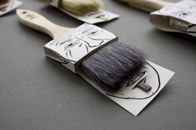
Another example of where illustration is mixed with packaging is the Poilu brush packaging by Simon Laliberté, which is a really simple yet clever idea.